|
Functions of Stage Lighting:
|
Jeff's Note: While most textbooks teach that there are four functions of stage lighting, I believe there are seven:
-
Visibility: If the audience can't see the actors, everything else the lighting designer does is a waste of time. Studies have shown that visibility affects our ability to understand spoken speech. This doesn't mean that the audience must see everything all of the time; a German director named Max Reinhardt once said that, "The art of lighting the stage consists of putting light where you want it and taking it away from where you don't want it."
-
Mood: (or "atmosphere") "Mood" is the evocation in the audience of the appropriate emotion. Many designers err in paying attention to mood to the point where visibility is sacrificed.
-
Composition: The act of painting a picture, in this case, with light.
-
Plausibility: Sometimes called "realism", but that's not always accurate, since not all plays - and certainly very few ballets, modern dance pieces, and operas - are realistic. It's the same quality that Stephen Colbert refers to as "truthiness".
-
Reinforcement: What are we reinforcing? Everything.
-
We reinforce the playwright's text: In A Midsummer Night's Dream, Puck has the line, "And yonder shines Aurora's harbinger," meaning the dawn. The lighting designer can reinforce this by providing the first rays of dawn.
-
We reinforce the work or the set and costume designers:
-
We might use colors that flatter or complement those used by our colleagues.
-
If the sets and/or costumes are sculpted and lush, we might light them so as to highlight their 3-dimensionality.
-
Revelation of Form: Decide on the level of 3-dimensionality you want the audience to see. In some productions, you might want a "flat" look; in others ? particularly in dance ? you might want a more sculpted look. A case could be made that revelation of form is part of composition or mood; however, it's important enough (in some productions, at least) to be a stand alone function.
-
Punctuation: The blackout at the end of a climactic musical number! The slow fade to black....
Judy has a different list:
-
Selective visibility: illumination and focus.
-
Indication of time and place (and any other realistic details necessary). (if not given in the play, it is often a good idea to invent them.)
-
Mood and atmosphere (often best conveyed through the realistic details you have invented; these are generally more specific and interesting than "blue for sad".)
-
Creation or emphasis of rhythm and punctuation.
-
Heightening effect of other visual elements of the production: set, costumes, mise en scene.
-
Integrative function: brings all other aspects of the production (dead scenery and live actors) and unites them into one world.
-
Just aesthetics - often there is a show where you don't have much to do besides illuminate, and another useful aim is to try and make it look prettier or more visually striking than it would have without your lighting, thus compelling audience attention more strongly and heightening the theatrical experience. It might be a simple comedy or ballet, and you might just want to frame it in nice color or throw some gobos on the cyc.
-
To aid in conveying whatever message you, the director, the other creative artists are trying to get across. An example might be that you're doing Othello and the idea is to create a feeling of the evil in the world overcoming the forces of good, so you (and the set designer hopefully, but not always) would strengthen that impression with light by having everything generally bright at the start and closing in to more isolated areas with dark outside as the play progresses.
-
Helping the actors! Actors are generally happy that the stage lighting shuts them off from the audience in a different world, but sometimes they may need extra help - it could be be as simple as some low-intensity light to help them find their way in the dark. Actors blinded by sidelights may be helped by having faint light on the floor; this is an absolute necessity for dancers en pointe.
Note that two designers who had never met and who work 8,000 miles away from each other have developed strikingly similar variations. Also note the differences; in art, there is rarely only one correct approach. If your instructor teaches a different list of functions and qualities than the ones on this site, s/he is right...but so are Jeff and Judy.
|
|
Qualities of Light:
|
These are the attributes of light which can be manipulated in order to fulfill the seven functions.
-
Intensity
-
Color
-
Distribution: Essentially, where the light hits the stage and from what angles. If we have a blue light hitting the SL side of the stage, and a red light hitting SR, that's a matter of distribution. If we flood the whole stage with an even wash of blue light, that's distribution. If we have an actor isolated in a tight special, that's distribution.
-
Movement: Any change in any of the other three qualities.
Judy's list is slightly different:
-
Intensity
-
Distribution
-
Angle
-
Color
-
Change and movement
-
Visual quality of the light field (diffuse, soft edged, or even and hard, with or without a clear outline.)
-
External look: beams cutting through smoke filled air.
|
|
Principles of Composition:
|
Unlike the functions of stage lighting, which outline the specific goals which lighting design must fulfill, the principles of composition are general guidelines which apply to all art forms, including writing, acting, painting...and, of course, lighting design.
These should be applied with flexibility. In art, there is always the danger of becoming overly academic and strangling the creativity with theory; nevertheless, if your design is not working the way you wanted, a good first step would be to consider whether or not you have complied with these principles and, if not, if that might be the problem.
-
Unity: The creation of a stylistic plan or concept to which all elements of the production or design conform. Note that while there may be an overall concept for the production, each designer will establish a concept for his or her own design discipline. Ideally, this concept will be rooted in the overall production concept; otherwise, the principle of "unity" is violated.
-
Harmony: The sense of blending and unity obtained when all elements of a design fit together to create an orderly, congruous whole. Note that for some productions, disharmony is appropriate.
What is the difference between "Unity" and "Harmony"? Unity is achieved when each element of a design fits in with the overall concept of the production. It is defined by how those elements relate to the production as a whole.
Harmony, on the other hand, is defined by how those same elements relate to each other.
For example, lets assume that we are doing a show about ducks:

In the graphic above, we have achieved both harmony and unity. The icons are all ducks and they are all the same shape and color. It may not be very interesting, but that's due to a lack of variety and contrast, which are concepts that we'll discuss below.
Now look at this group:

They're still all ducks and still the same shape and size, so we're still achieving unity, but the colors clash — they are not harmonious.
In our next example, the addition of the teapot conflicts with the overall concept of the production — that it's a show about ducks — so we now have neither harmony nor unity:

-
Contrast: The juxtaposition of dissimilar design elements. Note that elements can contrast with each other and remain harmonious. The Tony Award winning set and lighting designer David Hays once said that, "The primary tool of any form of design is contrast."
-
Variation: Too much uninterrupted harmony is monotonous.
So what's the difference between "contrast" and "variation"?
"Contrast" is a difference in one or more qualities between similar elements. For example:

In the above image, the ducks are similar — they're identical in size and shape — but whereas three of them are red and facing Stage Left, one is blue and facing Stage Right. This is an example of "contrast".
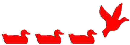
Compare this to the graphic below, in which all the ducks share the same basic qualities (they're facing the same direction and are the same color), but the fourth one is a radically different element — this duck is flying, while all of the ducks we've seen so far have been swimming. This is an example of "variation".
-
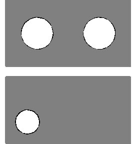
Balance: The arrangement of the design elements to bring a sense of restfulness, stability, or equilibrium to the design. There are two types of balance:
-
Symmetrical Balance: "mirror image", as in the first example, below.
-
Asymmetrical Balance: occurs when the composition is balanced in terms of weight and emphasis without one half's being a mirror image of the other half, as in the second example, below.
-
Proportion: The harmonious relationship (in terms of size) of the parts to each other and to the whole. Physical beauty in humans (or anything else) is largely based on proportion.
-
Emphasis: Directing the audience's attention to a specific place.
Judy adds:
To internalize the principles of composition and try and make them into second nature, go look at paintings! Artists have known and used these principles for centuries to try and get their feelings and ideas across. If there's an art museum where you live you should spend a few hours there every month. If not, you can find reproductions on the internet and in books. Look at all kinds of paintings (Vermeer is a personal favorite, but you should look at everything and all styles and periods). Don't just glance and walk on past, but pick out one painting and look at it for a long time. Don't worry about analyzing it at first. That comes later. First, just look at each painting for a long time and try to feel what the painter is telling you.
|
|


 Sales Manager Lok