|
The Visible Spectrum:
|
The range of electromagnetic radiation that is visible to the human eye is called the visible spectrum, or "visible light". Some colors discernable by humans are not contained in the visible spectrum; these are created by mixing two or more different wavelengths. Colors consisting of only one wavelength are referred to as "pure" colors. The degree of purity is called "saturation" or "chroma".
The colors of the visible spectrum are violet, blue, green, yellow, orange, and red. Because light travels in waves, it has both frequency (the number of waves that pass a given point in space during a specific time interval) and wavelength (the distance between any two corresponding points on successive waves). It's not crucial for you, as a designer, to know the frequency and wavelength of each color, but we're going to tell you anyway:

|
|
Color
|
Frequency
|
Wavelength
|
|
Violet
|
668?789 THz
|
380?450 nm
|
|
Blue
|
606?668 THz
|
450?495 nm
|
|
Green
|
526?606 THz
|
495?570 nm
|
|
Yellow
|
508?526 THz
|
570?590 nm
|
|
Orange
|
484?508 THz
|
590?620 nm
|
|
Red
|
400?484 THz
|
620?750 nm
|
|
Image courtesy of Wikipedia Commons
|
|
Note that frequency and wavelength are inversely proportional. The higher a color's frequency, the shorter will be its wavelength.
|
|
Color Mixing:
|
There are two ways to mix colors in lighting:
-
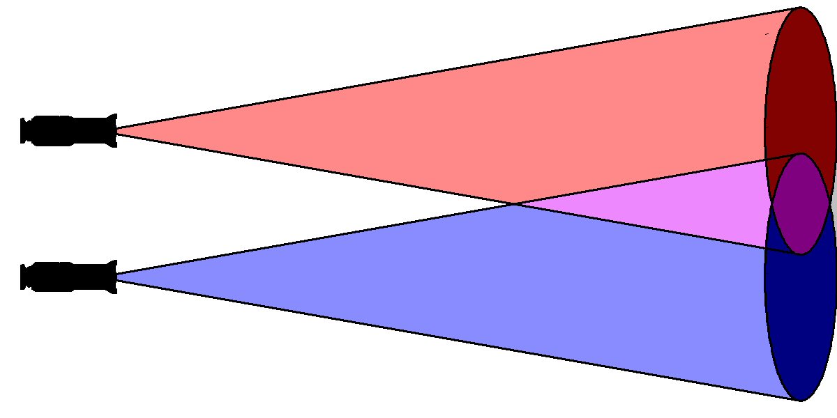
Additive mixing happens when two or more differently-colored lights are aimed at the same surface.
-
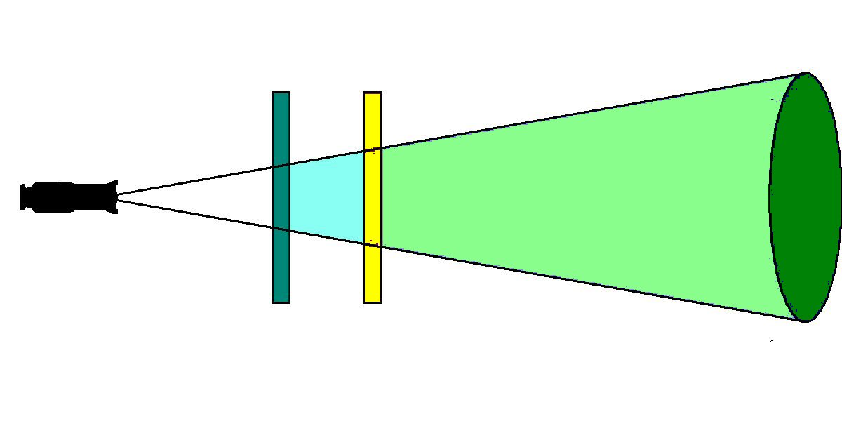
Subtractive mixing happens when a single light source shines through differently-colored filters. Each filter allows certain colors to pass while blocking or absorbing other colors.
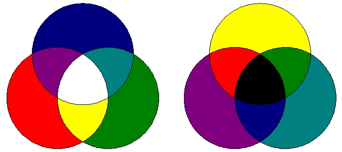
In additive mixing, primary colors are those three colors which, when aimed at the same place at the same intensity, theoretically form white light ("theoretically", because in practice, this is limited by the imperfections of color filters and light sources). These colors are red, green, and blue.
The secondary colors in additive mixing are those colors which can be created by evenly mixing two primaries. These colors are:
-
Cyan (blue and green)
-
Magenta (blue and red)
-
Amber (red and green. Really.)
Televisions and computer monitors create colors by using additive mixing. For example:
This sentence is 100% red.
This sentence is 100% green.
This sentence is 50% red and 50% green (See? I told you).
|
|
Additive Mixing
|
Subtractive Mixing
|
|
|
In subtractive mixing, the primary colors are those which can be created by evenly mixing two secondaries, as shown in the drawing above. In the example on the right, a white light is altered by inserting a cyan filter, which absorbs the red part of the spectrum and passes (or "transmits") blue and green light. The resulting cyan light is then passed through a yellow filter. This filter absorbs blue light, but transmits any red or green that may be present. Since there is no red (because we've already blocked it with the cyan filter) all that is transmitted is green.
Subtractive mixing is often found in automated fixtures. The act of inserting a color filter in front of a light is a very simple form of subtractive mixing.
Complementary colors are those colors directly across from each other on the color wheel:
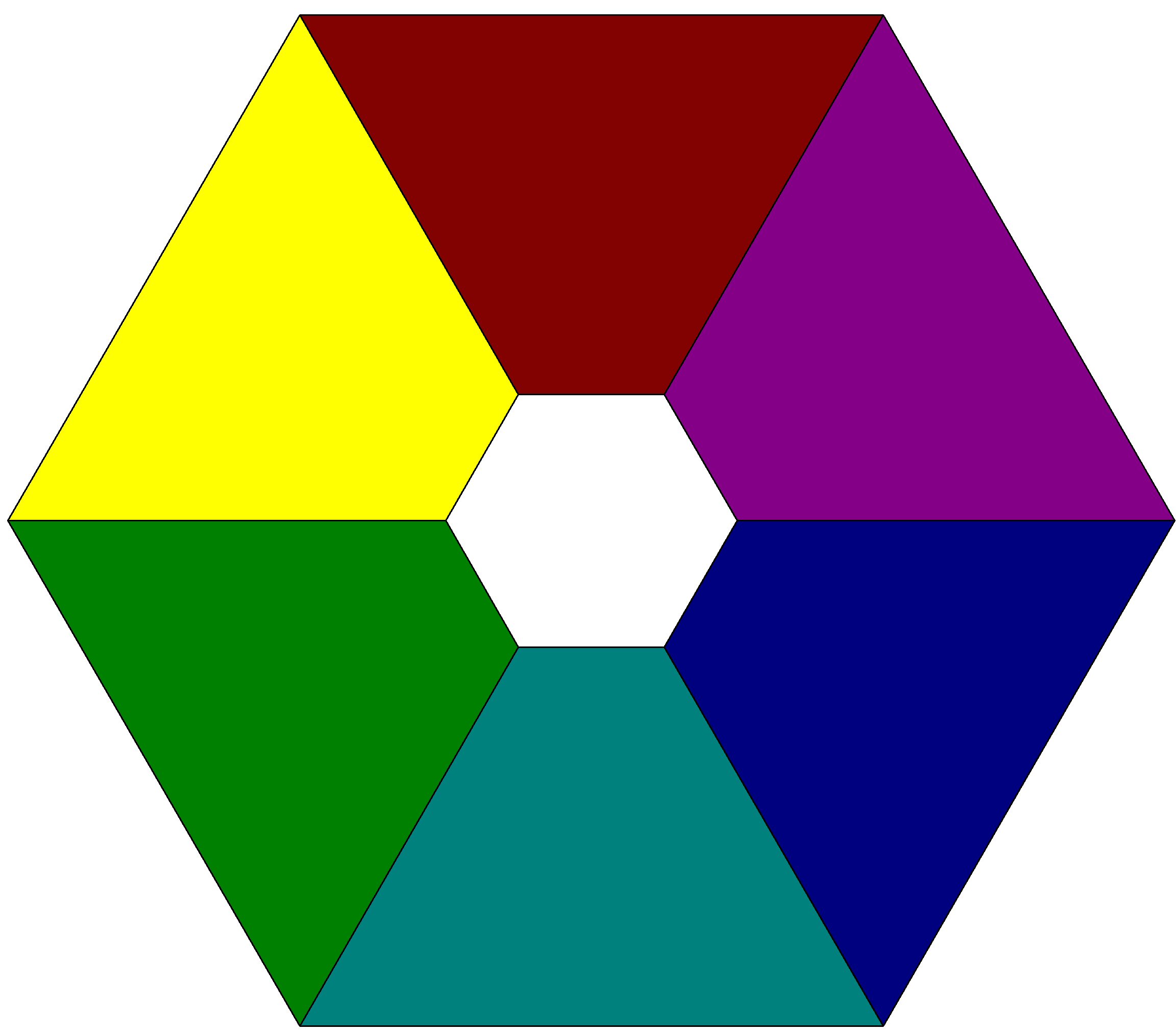
For example: yellow and blue are complementary to each other, as are green and magenta. As you can see, the complementary of any primary color is the secondary color formed by mixing the two remaining primaries.
Complementary colors, when combined additively on a neutral surface, form (in theory) white light.
Complementary colors, when used adjacently, reinforce each other; each makes the other appear to be more vibrant.


One of the most difficult problems faced by young designers is choosing color. The various manufacturers' swatchbooks (usually available free from dealers or from the manufacturers) offer literally thousands of possibilities.
How to choose? K.C. Hooper of Apollo Design Technology, a leading manufacturer of theatrical color media, offered these guidelines:
These are some of the major manufacturers of theatrical color media:
A very good discussion of the emotional impact of color can be found here:Color Theory for Designers, Part 1: The Meaning of Color
Jeff reminds you that the color wheel shown in the above link is subtractive, for mixing paint, not additive, for mixing light.
|
|
|
"White" Light Isn't White –
Color Temperature:
|
"White" light exists mostly in theory; at any given time, the light we think of as "white" is actually somewhere between a pale yellow and a pale blue. This range is referred to as "color temperature". It can best be demonstrated by setting the "white balance" on a digital camera to "daylight" and taking a picture under incandescent light. The resulting image will be slightly yellow, because incandescent light is yellower – has a lower color temperature – than does daylight. Likewise, setting the white balance to "tungsten" and shooting a scene lit by daylight will yield a photo that is slightly bluish, since daylight has a higher color temperature than does tungsten light.

|

|
For this photograph, the white balance
was set to "daylight" (or "outdoor").
|
For this photograph, the white balance
was set to "tungsten" (or "indoor").
|
Color temperature is measured in "degrees Kelvin," abbreviated as "K." As mentioned above, the bluer a light is, the higher its color temperature will be. Below is a table of approximate color temperatures for common light sources:
|
Light Source
|
Color Temperature
|
|
Overcast Daylight
|
6500? K
|
|
Typical Daylight
|
5500?–6000? K
|
|
Theatre Lighting / Photofloods
|
3050?–3400? K
|
Standard Incandescent
Theatre Lighting
|
3000? K
|
Household Incandescent
Light Bulb
|
2700?–3300? K
|
|
Limelight
|
2400? K
|
|
Gaslight
|
2200? K
|
Sun at Sunrise
or Sunset
|
2000?–3000? K
|
|
Candle Flame
|
1850? K
|
|
Match Flame
|
1700? K
|
So what does this mean? From what are these numbers derived? The temperature is referenced to that of a standard "black body" – a block of carbon which, when heated to specific temperatures, emits light of specific colors.
The Kelvin scale (named after British physicist William Kelvin) is a variation of the Centigrade/Celsius scale, except that rather than its being keyed to the freezing point of water, it is based on "absolute zero". If you subtract 273 from a Kelvin temperature, you will have its Celsius equivalent.
You may be thinking that none of the colors above looks like "white".... and you're right. First of all, they are merely approximations and not, as such, accurate. Secondly – and more important – the eye (or, more accurately, the brain) adapts. We tend to automatically "white balance" ourselves to the dominant light source in our environment at any given time. If, for example, you spend a significant amount of time outdoors during the daylight hours and then go into your house or apartment, the interior lighting may look yellowish for several hours, until your brain "white balances" to its new environment. This is something you should remember, by the way, when you're writing the first few cues of your show.
|
|


 Sales Manager Lok